UX Designer
user interviews
cognitive walkthrough
heuristic evaluation
wireframing
prototyping
validation
Team
6 Engineers
3 Designers
Project manager
Tools
Figma
Figjam
Lucidspark
Lucidchart
Maze
Pen & Paper
Timeline
10 weeks
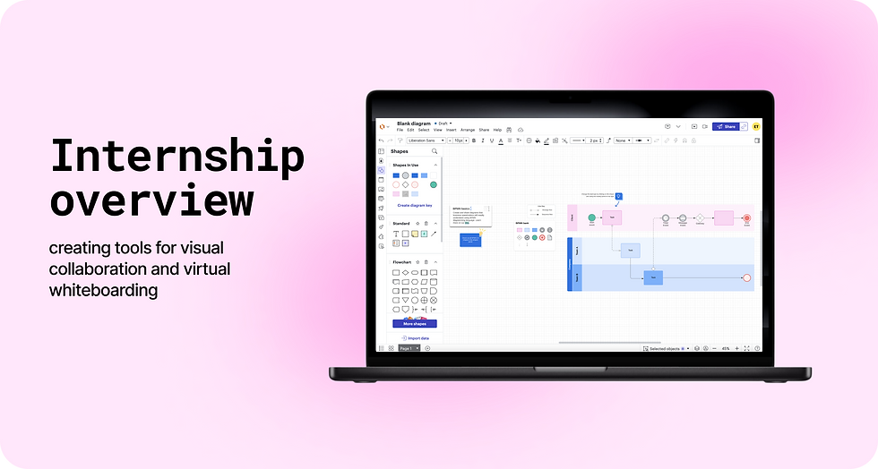
Internship overview

The context
Lucidchart and Lucidspark are canvas-based tools used for knowledge workers, supporting things like diagramming, brainstorming, and visual collaboration. Lucid wanted to better support agile workflows with our products, where teams work in short chunks of time to rapidly push, test, and iterate.
The solution
My particular focus was on templates and tools used by knowledge workers to kickstart their documents and meetings, designed to power the agile workflow.
My wins at a glance
I was fortunate to have multiple designs shipped in the product, including messaging, a feature redesign and 22 templates. Throughout the summer, my team successfully pushed our key metrics, tripling a new feature’s usage and increasing template engagement.


PROJECT 1
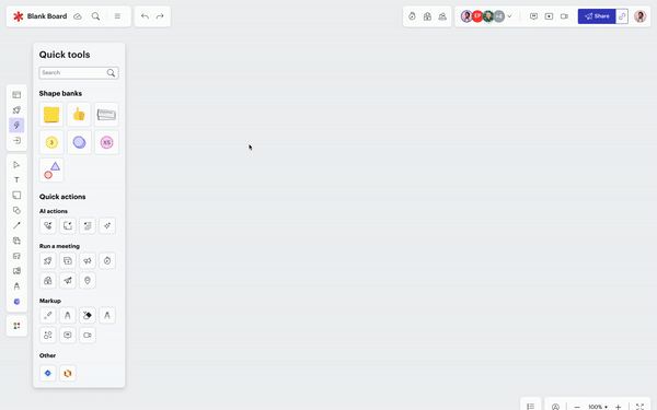
Redesigning the quick tools menu
The context
Quick tools allow users to take action from the canvas rather than the toolbar. Instead of finding each tool in the toolbar, they can leave tools on the canvas for easy access. They include quick actions, like the pen or comment tool, and quick shape banks, like a stack of sticky notes or shapes.

The problem
We had anecdotal evidence that the menu was difficult to scan, and the lack of parity between the toolbar and on-canvas appearance confused users. 'I didn't expect it to look like that!'
My ideations aimed to improve ease of scanning + canvas-tool parity
Idea 1: Preview flyouts
Pros: compact, visually appealing
Cons: less accessible, higher lift

Idea 2: Differentiated banks + actions
Pros: more canvas-toolbar parity
Cons: shape banks are less compact

Idea 3: Tab structure
Pros: more potential for adding things to menu
Cons: harder to access non-default tabs, more navigation required
From my ideations, new questions arose
How compact can we go?

We need to provide enough information to make the menu intuitive while minimizing the need for scrolling
How much differentiation?
We need to differentiate the shape banks from quick actions while also unifying the quick tools as an overarching category
From these questions, I struck a balance in my final design
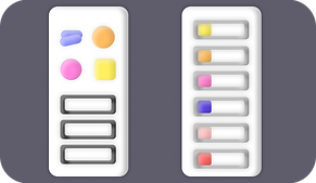
Old menu

New menu

The visual representation of banks + actions
have unity because they take up similar space (wide, short rectangle), but have visual differentiation through the icon style
maintains a compact structure while still providing both a visual + text
The shadow on hover
helps users understand that these are draggable shapes rather than regular tools
Intent-driven categorization & search
helps with finding tools, and accordions allow users to close items that aren’t important to them
The design succeeded in the wild!
The design was released internally via a/b test, and metrics were carefully tracked. Due to the relative novelty of the feature and the aesthetic nature of the changes, we wanted to see how the design performed in front of real users, in the most natural setting possible.
The test performed well, and the new design is now released for external users in production!
PROJECT 2
Redesigning templates to better suit user workflows

Goals
-
enforce a consistent brand identity
-
create templates that better suit user workflows
Metrics
-
increase template engagement
-
increase intelligent feature usage
Methods
-
cognitive walkthrough
-
heuristic evaluation
-
unmoderated user tests
Here's a look at 3 examples of my template designs! Don't worry, I won't make you look at all 22
Creating a new template for risk management
This "Safe Roam Board" was one of our must-haves for the agile intiative.

Redesigning the BPMN collaborative diagram template

The template redesigns moved our key metrics
Increasing intelligent feature usage

From incorporating quick tools in our templates, quick tool usage tripled in the 3 months during our work
Increasing users finding value from templates

Our enterprise users are also finding increased value with our templates, shown through Net TUR (which ignores documents where no shapes are added after the template is added)
PROJECT 3
Designing messaging for Breakout boards
“Breakout boards” are separate boards that live within a main board--separate documents for smaller groups of people. They had great potential in our team-level templates, but our discovery research showed that users didn’t know where to find them, what they were, or their relationship with the main board.
I introduced messaging to solve those pains

This messaging is built and will be in product soon
This messaging will help our enterprise users in some of our top strategic templates, which are key to Lucid’s agile initiative.
Redesigning the website wireframe template

