
UX Designer
user research
ux audit
wireframing
prototyping
validation
Team
1 co-designer
Tools
Figma
Figjam
Squarespace
Qualtrics
Pen & Paper
Timeline
3 months for redesign
Project overview

The context
Back to Bach is a musical nonprofit that supports arts education through performances at local elementary schools, virtual events, and video productions.
The problem
BTB’s mission received overwhelming support, but users reported difficulties finding information on the website, and both members and non-members lacked clarity regarding what exactly the organization does.
A sneak peek at the solution
Here's a quick preview of our solution before getting into the process. With such fundamental information missing, we added a few key pages that were missing from the former site.
Pages dedicated to each artistic division provide clarity

The regions page shows BTBs influence and connection with regions

A site-wide visual refresh provides a younger, more cohesive feel


A "Get involved" tab provides clear, actionable opportunities to work with the organization
Research: where it all began
Success meant increased engagement for prospective members, parents, and educators
My co-designer and I interviewed the CEO of the non-profit to establish goals, KPIs, and to prioritize which parts of the large website should be redesigned.

The website had major usability issues, with users failing basic tasks
After hearing from our CEO, we surveyed 23 parents, 13 educators, 18 prospective members, and 18 non-categorized who were unfamiliar with the organization.
Overall Usability
Users found overall usability to be poor, indicating a need for a large-scale redesign.
Using the System Usability Score (SUS) standardized survey questions, we calculated a score of 42.62/100, indicating severe usability issues. After using this method as a triage, we delved deeper into the key problems behind this poor usability.

Part 2: User Tasks
Users failed to successfully locate key information about the program offerings, roadblocking any engagement with the organization.
2/65 respondents correctly identified all 5 artistic divisions.
None of the participants correctly identified all programs offered by the music division, or the art division.
Part 3: General Feedback
From the delights, we knew to emphasize our mission and highlight our media. From the pain points, we tackled reducing text and streamlining user flows.

User interviews confirmed our hypotheses on the source of usability issues
We then interviewed 5 educators, 5 prospective members, and 3 parents for more in-depth feedback. Users performed timed tasks specific to their roles, with a max time of 2 minutes. The testing and follow-up questions informed our re-designed information architecture and gave qualitative reasonings for the survey's quantitative data.

Define
Our user personas for prospective members and parents summed up our key insights
Combining the information from the surveys and interviews, we created user personas. We referred to these personas throughout ideation and designing to ensure that our users’ needs were being constantly considered and met.


Ideation
From analyzing competitors, we decided to implement persona-specific flows, prominent call to actions, and impact numbers
We then analyzed the websites of other non-profits in the arts education space, noting similar features to implement as minimum requirements.
Through the Staff: CTA's targeted to specific users
-
Displays target users and what they can do
-
Streamlines the flow of target users
-
Provides a specific and actionable way to engage with the organization
Do Re Mi: CTAs and impact numbers
-
Explains how users primarily engage with the organization
-
Provides immediate action for a high visitor conversion rate
-
Builds credibility
-
Attracts prospective members, teachers, and donors
Save the Music: What We Do
-
Shows the actionable ways the organization fulfills its mission


Based on the research insights, we developed the information architeccture
Keeping in mind the categories important to our users and what information users expected to find where, we developed the IA of the redesigned site.

Design
With our users' goals and needs clear, we sketched out preliminary designs
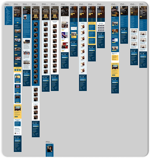
Below are some of my sketches, trying out various layouts and user flows before investing in higher fidelity prototypes
Home Page
Here, we laid out sections from top to bottom based on priorities of the users mentioned in user interviews.


About Page
This page was less problematic in the user interviews, so we made minimal changes to focus on other areas.
Classical Music Page
This was an essential addition to the website, detailing exactly what Back to Bach does in their biggest artistic division.

This section previously didn't exist
After critiquing sketches, we built up to mid-fidelity prototypes


With stakeholder approval, we progressed to high fidelity designs
By gradually building up to higher fidelity prototypes, we had lots of flexibility and room for consideration at each step.

Close-up of key changes
A quick example of key changes made just on our landing page, all informed by our user research.
Before


After
Evaluation
Overall usability increased significantly
We had different users perform the same usability tasks asking the same System Usability Score standardized survey questions. After the redesign, we saw a significant improvement in usability, with an 89% increase in score.

Critically, task completion also improved
Before
-
Only 3% of respondents correctly identified all artistic divisions.
-
None of the participants correctly identified all program offered by the music division, or the art division.
After
-
96% of respondents correctly identified all artistic divisions.
-
All of the participants correctly identified all programs
-
offered by the music division, or the art division. .
Key metrics showed major improvement in the months following
After the redesign, the volunteer application rate increased by 40% and performance invitations, while still underutilized, increased from once or none a month to 5 monthly.
Monthly unique visitors increased by 51% post re-design compared to year before

The system usability also increased dramatically, the site's traffic increased significantly, and users were far more successful in identifying key information about the organization. Most importantly, the site received more member applications and invitations to perform- the main goal of the organization!
Reflection
This project taught me a lot about advocating for the user. Since I was new to the organization and did not have a previous relationship with the CEO, it was especially important that I back any changes to the website with data-informed reasoning. The CEO was very passionate about her work, so I continuously had to voice the why behind every decision, which made for a thoughtful design process.
