UX Designer
user research
conceptualization
wireframing
prototyping
Team
3 co-designers
cross-collaboration with 8 teams
Tools
Figma
Figjam
Wix
Pen & Paper
Timeline
2 months for initial product
Problem context

The problem
There are 30.1 million uninsured individuals in the United States, and more than half report delaying medical care due to cost. This results in increased mortality and preventable suffering, especially within underserved and marginalized communities.
The solution
A telehealth platform where volunteer physicians and therapists can treat underinsured or uninusured patients.
A sneak-peek of our solution

Receive care through trusted community organizations
Sign up individually through a straightforward process


Learn about what we do & volunteer with us
Starting from the beginning: Research
We needed a credible, informational website for both volunteers doctors and patients
I interviewed the founder as well as commitee representatives to identify goals, KPIs, potential blockers, technological constraints, and to begin building brand identity.

Meeting with users helped us determine key features
Our outreach team kept us updated on community needs
Our outreach team gave us insights from several community organizations that work directly with our users, including safety net clinics, churches, food pantries, and homeless shelters.


Subject Matter Experts gave us insights into telehealth best practices
Since this is such a niche space that requires highly specialized knowledge, we cross-collaborated with our growth and medical teams to learn more about what experts in the telehealth space had already discovered as best practices.
Our resources included telehealth conferences, medical advisors, faculty advisors in sociology, and meetings with other telehealth nonprofits.


Our key features involved accessible icons, transitional care resources, mobile-first design, and building trust
Our SMEs gave us great insights on particular needs of our demographic, and external whitepaper research allowed us to identify design implementations to combat these specific user needs.

For physicians, we prioritized an easy onboarding and connection to our mission
Through consulting our medical advisors, who were providers themselves, we were able to identify key considerations for our other user group:
-
The onboarding process needed to be quick, easy, and self-directed
-
Providers wanted to know who they were helping
-
Providers are burnt out from COVID right now. It's easier to go through trusted community and volunteer organizations than to establish new relationships.
We summed up findings in our journey map
After distilling information from self research and expert advice, I initiated a journey mapping meeting with representatives from each committee, ensuring we kept the patients at the forefront of our minds, and that our product consistently addressed the user’s needs.
Since we were outsourcing the appointment management to Cliniko, we had less control over provider workflow and did not focus as much on their journey.

Ideation
Competitor analysis gave us a starting point for how to create a simple, accessible, and trustworthy experience
Features to implement (high impact, low effort)
-
Step by step "how it works"
-
No login for booking appointment
-
CTAs on landing page based on user type
-
Emphasis on transparency
-
List of providers
-
Testimonials
-
"Why volunteer"
Nice to have (high impact, high effort)
-
Chat service follow up
-
Asynchronous care
-
Doctor reviews
-
Prescription Assistance

Prioritizing simplicity, we created the information architecture
In designing the information architecture, we kept in mind our goals of simplicity and minimal content

Design
We first ideated with pen and paper
My co-designers and I sketched the basic flows for the website, keeping in mind the common layouts from the competitor analysis. We met to present, compare, and discuss the strengths of our respective sketches.

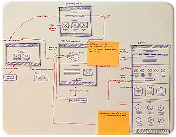

We then moved to low fidelity wireframes
After discussion with my team, I created low fidelity designs for the website on Figma, mapping out basic layouts. Due to the constraints of Wix, we had to design desktop first, although mobile-first design was preferred.

Our design system helped to enforce consistency
Our team created a design system to maintain a consistent brand identity across the platform.

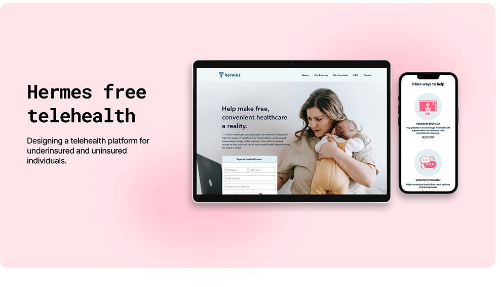
Final product
You can view the final product in its entirety at freetelehealth.org. We have continued to build on the site since creating the original MVP, iterating, evaluating, and so on!
Mobile highlights

Desktop highlights

Evaluation
What has our product achieved?
So far, we have achieved several of our founder's goals through the use of the website
-
400+ patients receiving free mental healthcare
-
Partnerships with large organizations like Betterhelp, the world's largest therapy platform, and Giving Health, an established telehealth organization in Atlanta
-
Partnerships with community organizations that believe in our cause
-
Recruitment of medical advisors and growth advisors who are experts in their fields
By going through Betterhelp, we've achieved 600 months of free therapy appointments for our patients, who we are reaching out to through community organizations.
Reflection
This project taught me that product design is truly a collaborative effort that requires an understanding each and every aspect of the company and its mission. Throughout building just the initial product, our team was constantly interfacing with legal, outreach, growth, and more to learn about what we can do for users. None of our success would have been possible without the hard work of other teams and our communication with them.
I also kept coming back to the issue of assuming the user's needs. Through working for users who are so removed from me or my peers, I was forced to remember at every point to make design decisions based on our user research and not on a whim.